fedora design

Fedora 40 Wallpaper Talk!

The Fedora wallpaper is always on such a journey 😄. The last blog post I wrote specifically dedicated to the Fedora wallpaper is linked here if you’re interested in reading and getting a sense of what goes into it.

As I write this, Fedora 40 is live, and being the big four-zero the other design team members and I thought we should do something special. Instead of being inspired by a STEM person in history with an O last name we chose the word “Open” (conveniently starting with O as well!).

We always create a mind map to brainstorm different ways of interpreting the theme we could go with.

1. Open Outdoors

Slightly obvious with the open outdoors and the word “open”. But in the same way that open-source software is developed in a collaborative, public manner- nature works in a connected and collaborative way as well to create something bigger and better.

2. Trees

Trees have roots and branches that spread out and interconnect. Trees continue to grow, change, and distribute seeds, similarly to open-source code. Obviously, open source doesn’t distribute literal seeds, but seeds of knowledge are thrown into the community!

3. Open Windows to Nature

Having an inside window looking outside shows that we’re always looking towards something with an open mind. Inspired a bit like the Lo-Fi girl who sits next to a window, it would provide a very appealing wallpaper.

4. Open Path

Again, it’s a bit on the nose with “Open” but we wouldn’t want to illustrate a closed path haha, now would we? The possibilities are endless on a path though. In the same way, working together in an open-source way offers endless opportunities that closed-source software might not.

After we made the mind map I felt inspired to create the image below in Krita. It started as just playing around with different textured brushes and seeing what I was immediately drawn to. I then drew over what I had on a separate layer with a proper guideline.

An open path or river, up to the viewer’s interpretation, through the tree’s overlapping connecting branches.

Fedora 40 Day Wallpaper

Fedora 40 Night Wallpaper

This was intended to be just the beta wallpaper. As the creator of the piece, I didn’t think it looked finished, and there were details I wanted to add to make it perfect. Although there’s a phrase I try to live by in situations like, “Make it finished, not perfect.” And this was a finished wallpaper!

The Fedora wallpaper is not a project that is entirely on my shoulders though. It’s always a collaboration! As the deadline quickly approached we luckily had a few contributors who had some options for F40. Below are some of the first ideas and drafts from Yotam Guttman.

wip 1

The orange and brown desert path version is the first draft of how we ended up with the images below! Yotam had so many different ideas and did an amazing job taking constructive criticism from the team and taking the first version to the last.

wip 2

wip 3

In the Fedora 40 ticket, you can see all the conversations and different versions.

The amazing Yotam Guttman created the images below in Inkscape as an option for F40!

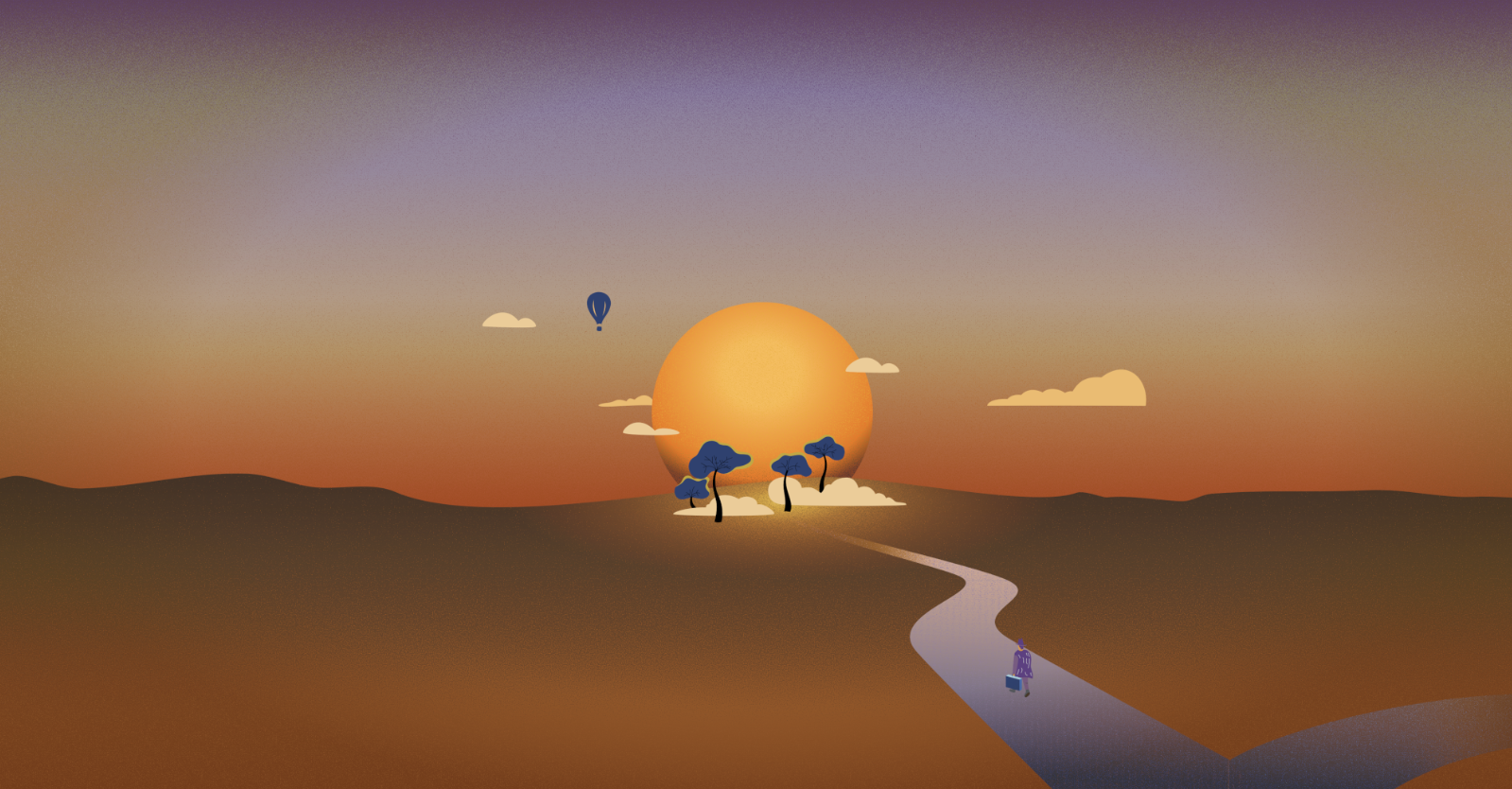
Fedora 41 Day Wallpaper

Fedora 41 Night Wallpaper

The Design Team and I absolutely loved Yotam’s work and were set on using it for F40 but for various reasons, deadlines creeping up on us, it was easier to use the beta wallpaper as the final wallpaper. We have used the beta as the final wallpaper before and it isn’t a big deal. But we loved those art pieces above and really wanted to use them! So we are going to use them for the Fedora 41 Wallpaper!

What does this mean?

Well! The great thing is that we are now ahead of schedule for F41!

F41 would have been inspired by something starting with the letter P, and this piece of work has a beautiful P as in Path! We plan on using the finished versions designed by Yotam (you can see any small updates and documentation on the F41 ticket here) and are ready to start working on the F42 wallpaper!

This way we can have more flexibility for edits, and time between finishing the wallpaper and handing it over for the Final Freeze deadlines. In the future, with all the wallpapers we will be ahead of schedule from this development!

If you’re interested in contributing to the Fedora 42 wallpaper find out more at this ticket. Anyone is welcome and encouraged to engage and participate!

Mid February Update

Well! The biggest update is the day and night versions have been finalized for the beta release of Fedora 36. Obviously we chose Deepika Kurup to inspire the wallpaper and had a mind map session as well as some thumbnails that steered us in the right direction.

We kept in mind the concepts we’d talked about at our first mind mapping session, Nature/Water Cycle, Transparency/Reflection, and Filter/Purification. Eventually we discussed an artist called Nobuhiro Nakanishi, who’s layered artwork uses rectangular glass plates to create immersive landscapes that form a wide landscape.

Mo proposed, “layered shaped glass textured landscape, maybe vertically taller than Cathedral Dusk to show layers of ocean or layers of soil beneath.”

I could draw the landscape’s textures to hand over to Micah who could take them into blender. Like an artist creating a fabric’s design, and handing over the finished fabric to someone who can drape it on the mannequin into an outfit.

I came up with the abstract landscape below based off the surrounding inspiring imagery. Each part of the landscape would be partially transparent pane and because it was digital, we could have clouds and parts that wouldn’t logistically make sense in the real world.

So where were we last week? I had the general landscape figured out, some of the trees blocked in with leaves texture, but the three blocks of land and water still needed attention and I was having a tough time rendering the clouds.

So I decided to just turn that layer off so I could hopefully come up with a better cloud rendering.

To create this landscape in Krita, I used a bunch of clipping layers. For example with the grass. I used the selection tool to draw a shape, used the bucket tool to fill it, and then you do ctrl shift g to create a clipping group folder. Once the clipping layer is on you can only draw on that shape. If you try to draw outside of the shape it won’t show up. And the beauty of it is you can have multiple clipping layers on an object.

Which is great because if you want to change an aspect of it later on, like the base color to be darker or a different color it won’t erase all your hard work painting the texture.

Instead of making cloud shapes with the bucket tool and painting within that shape- I decided to use a transparent brush to softly bring them to life and keep them lighter and loose.

The background clouds were the first ones I was happy with and once I added the fake light source in the back it started to pull a lot of the elements together. Having that common theme of a little yellow light was helpful.

Then Mo reminded me that it needed a different dimension so the canvas size had to be changed.

Lots of little changes went on in between these two images. Added the front clouds, the little fish, the rest of the trees, the leaves texture, and more detail in the grass.

For the night version, I thought about taking it into gimp but because I already had all the elements in individual folders I started off by just duplicating the file. And since most of them had masking layers I could either change the base color, like with the sky, or I could just add a blue tint over the whole part.

Each pane got different levels of blue to try and keep the levels of contrast. I moved the fish to imply they were swimming somewhere different now, as well as the clouds.

I’ve already gotten a great amount of feedback on both of these! Taking this night version, which is honestly more like a dusk version, and making the sun into the moon to take it full nighttime mode has been suggested. Moving the clouds on the right so it’s not such a heavy stack of clouds is going to happen.

And for the day version playing around with the blue sky, potentially adding butterflies or birds, and looking at the trees on the right to see if they work better as islands over the blue water instead of being enveloped by the wave.

I worked on a few other things but this was the majority of my past week so wanted to lay it all out :)